What You Should Consider When Designing Wall Graphics
- Posted by TVadm
- On June 18, 2024
- 0 Comments
Wall graphics are more than just decorative items in an office space. For businesses, these large-scale visual displays inject character, communicate brand values, and can even direct the flow of customer interaction. In today’s market, where attention is a coveted commodity, a personalized, impactful design can be a vital competitive edge. But how do you ensure that your wall graphics aren’t just wallpaper – that they truly enhance your business environment and captivate your audience?
In this comprehensive guide, we’ll walk you through the essential considerations when planning and creating wall graphics that not only look good but also reflect the essence of your brand and serve a strategic purpose.
Knowing Your Space and Objectives
Before a single brushstroke or graphic design program is opened, understanding the space and your objectives is critical. What is the layout of the area you are looking to enhance? Are you focusing on a reception area, team workspace, or a public-facing section of your business?
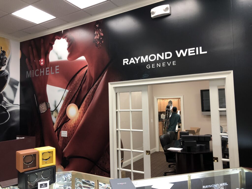
Space Analysis – Examine the size, shape, and any architectural features that you want to work with or around. This includes doors, windows, and structural supports. Wall graphics should complement, not compete with, these elements.
Defining Your Purpose – What do you want to achieve with your wall graphics? Is the primary goal to educate, welcome, or inspire? Do you seek to create an immersive brand experience, direct foot traffic, or simply add a touch of aesthetic appeal to a dull space?
Target Audience Considerations – Who will be interacting with the wall graphics? Understanding your typical customer, employee, or visitor can inform the messaging and tone. For example, a vibrant and playful design might be well-suited for a children’s clinic waiting room, while a more understated, professional look would be expected in a corporate boardroom.

Brand Reflectivity and Consistency
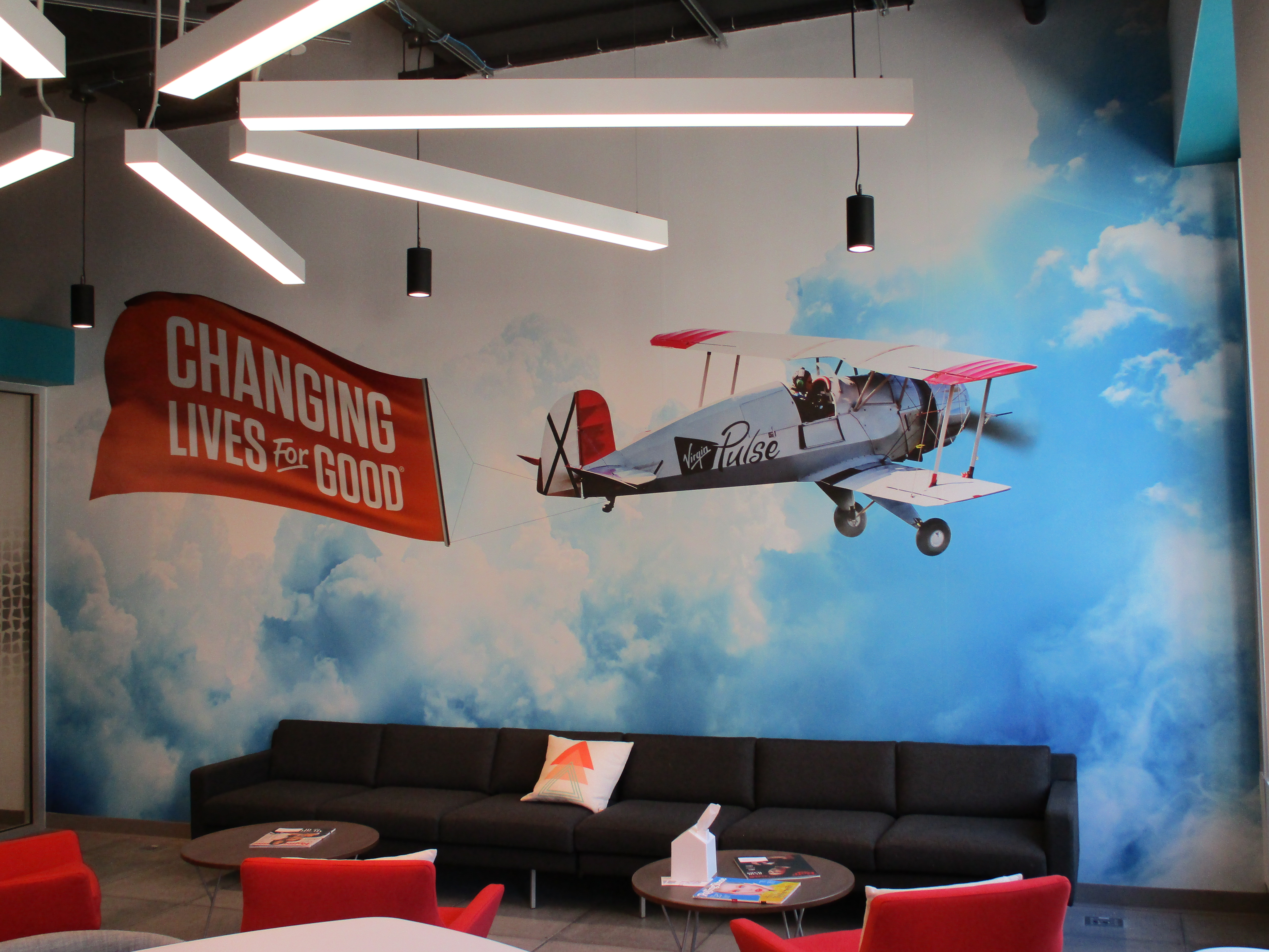
Wall graphics offer a unique opportunity to reinforce your brand identity in a three-dimensional space. Your design should be a visual extension of your brand, speaking to the same values and personality that your other marketing materials convey.
Color Palette and Typography – The colors and fonts used in your wall graphics should be consistent with your brand guidelines. If your logo is a key component, ensure its integrity is maintained in the design. Consistency across these elements helps build brand recognition and trust with your audience.
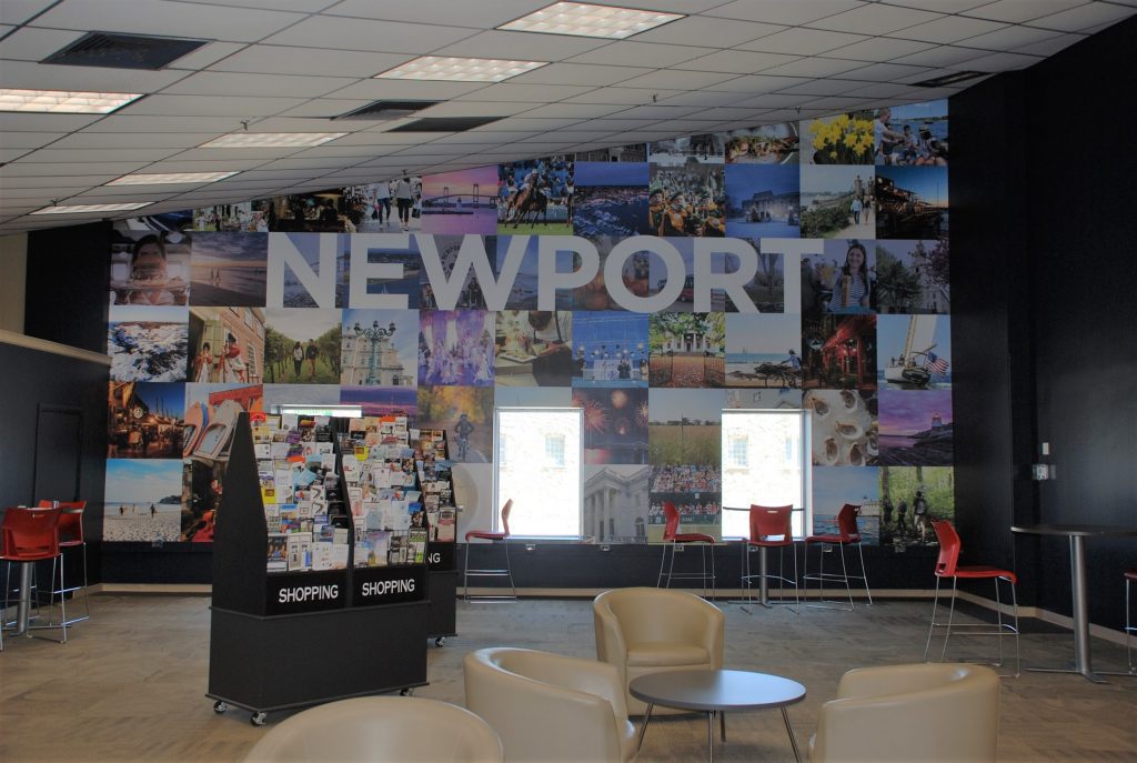
Storytelling with Imagery – Choose graphics that tell a story about your brand. This narrative can be historical, showcasing your brand’s evolution, or aspirational, highlighting the benefits your product or service offers. Imagery is a powerful tool in evoking emotions and can leave a lasting impression on your audience.
Utilizing Brand Keywords and Messaging – Incorporate brand-specific messages or taglines into your wall graphics. These verbal elements can be as impactful as the visual ones, reinforcing the essence of your brand and what it stands for.
Designing for Impact and Longevity
Wall graphics are a long-term investment, so their design should remain relevant for a considerable period. At the same time, it’s crucial to create a design that seeks to grab attention and make an impact from the moment it’s unveiled.
Avoiding Trends – Trends come and go, and you don’t want your wall graphics to look outdated before their time. Instead, focus on timeless design principles that will look good for years to come.
Scalability and Modularity – Consider if your design can be scaled for different wall sizes and shapes within your premises. This modularity can make the design more cost-effective and adaptable as your business grows or changes.
Material and Finish – The material you choose for your wall graphic will impact both its look and longevity. Matte finishes may be more readable if your space has glare issues, while glossy finishes can add vibrancy to colors. Research weather-resistant and fade-resistant materials if your graphics will be subjected to extreme sunlight or the elements.
Practical Considerations for Production and Installation
While a breathtaking design is essential, the practical considerations of production and installation cannot be overlooked. Collaboration with professionals in these fields can ensure a smooth transition from concept to reality.
Finding the Right Partners – Seek reputable design and signage companies who have experience with large-scale graphics. Discuss your needs and vision with potential partners to ensure they understand the complexity of your project.
Regulations and Compliance – Be aware of any local regulations concerning the design and installation of wall graphics, particularly if you are in a historic district or your business operates in an industry with specific guidelines.
Installation Factors – Installation can be complex, and factors such as wall texture, electrical outlets, and ventilation may impact the process. Design with these in mind to minimize complications and ensure a professional finish.

Maintenance and Refresh Cycles
Like any investment, wall graphics require care and attention to maintain their luster. Think ahead to how you will manage cleaning and repairs, as well as when you might want to refresh the design to keep it relevant.
Cleaning Guidelines – Develop and adhere to a regular cleaning schedule to keep your wall graphics looking their best. Harsh chemicals can damage the material, so use only approved cleaning solutions and methods.
Refreshing the Design – Consider how often your graphics will need updating to reflect changes in your business or the market. Some elements, like digital displays or vinyl lettering, can be periodically refreshed to keep the space looking current.
Repair Procedure – Have a plan in place for addressing any damage that may occur, such as tears or peeling corners. Knowing who to contact and how quickly repairs can be made helps maintain a professional appearance.
Measuring Success and Effectiveness
It’s important to evaluate how well your wall graphics are performing in line with your initial objectives. This will guide any future design or layout changes to further optimize your space.
Gathering Feedback – Solicit feedback from customers, employees, and visitors on the impact of your wall graphics. What do they notice first? Do the graphics align with their perception of your brand?
Analyzing Data – If your wall graphics have a direct marketing or directional function, track relevant data before and after the installation to measure their effectiveness. Are customers finding their way more easily? Is there an uptick in engagement with advertised products or services?
Visual Impact – Finally, consider the visual impact of your wall graphics from different angles and lighting conditions. Take photographs and review them to see if the message and desired visual impact are retained.
Wall graphics are a powerful tool for businesses looking to tell their brand story in a memorable and immersive way. By carefully considering the space, existing branding and design principles, you can ensure that your wall graphics are a strategic asset that enhances your overall business environment. Remember, the process of creating wall graphics is a truly collaborative one, requiring input and expertise from various stakeholders. Communicating your vision clearly and being open to professional advice can result in a final product that you and your audience can be proud of. Invest the time, creativity, and resources to design wall graphics that truly encapsulate your brand essence. Give the team at Graphic Innovations a call to start transforming your space today!


0 Comments