What to Consider When Designing Graphics for Your Next Big Event
- Posted by TVadm
- On November 12, 2024
- 0 Comments
Planning a major event can be both thrilling and overwhelming. Among the many tasks, designing graphics that grab attention and convey the essence of your event might just be the most daunting yet rewarding. Whether you’re a marketing professional, event planner, or graphic designer, your visual creations can make or break your event’s success.
From choosing the right colors to ensuring your graphics align with your brand’s identity, Graphic Innovations will guide you through the key considerations in crafting visuals that not only attract but also engage your audience. With practical advice, real-world examples, and proven strategies, you’ll be equipped to design graphics that leave a lasting impression.
The Power of First Impressions
First impressions matter, especially in the world of events. Your graphics are often the first point of contact between your event and potential attendees. A stunning visual can captivate, while a lackluster one might lead to a missed opportunity.
Graphics are more than just eye candy; they’re an integral part of any event’s narrative. They communicate the theme, tone, and even the caliber of your event. When executed well, they become a magnet for attracting attendees.

Understanding Your Audience
Knowing your audience is crucial when designing event graphics. Different audiences have different preferences, and tailoring your visuals to meet these can significantly boost engagement.
Before starting your design, conduct research to understand who your attendees are. Are they young professionals looking for networking opportunities? Or perhaps art enthusiasts eager to explore new exhibitions? Your graphics should reflect their interests and needs.
Consider a tech conference targeting industry leaders. Sleek, modern designs with a focus on innovation may resonate more than playful, whimsical graphics. Aligning your visuals with your audience’s expectations can foster a deeper connection.
Consistency with Brand Identity
Your event’s graphics should align with your brand identity. Consistency builds trust and recognition, ensuring that attendees associate your event with your overarching brand.
Use colors, fonts, and styles that reflect your brand’s personality. If your brand is known for its minimalist aesthetic, keep your graphics clean and simple. Conversely, if your brand is bold and daring, don’t shy away from vivid colors and dynamic designs.
Take Apple’s product launches, for instance. Their sleek, minimalist graphics mirror the brand’s commitment to innovation and elegance, reinforcing their identity and creating a seamless brand experience.
Choosing the Right Color Palette
Colors evoke emotions and set the mood for your event. Selecting the right color palette is essential in conveying the right message and attracting your desired audience.
Understand the psychology of colors and how they relate to your event’s theme. For example, blue often signifies trust and professionalism, making it an excellent choice for corporate events. On the other hand, vibrant reds and yellows can generate excitement and energy, ideal for festivals or concerts.
Typography Matters
Typography plays a vital role in event graphics, influencing readability and conveying tone. The right font can enhance your message, while the wrong one can diminish its impact.
Ensure your typography matches the event’s theme and is legible across various platforms and sizes. For formal events, classic serif fonts can convey sophistication, while sans-serif fonts offer a modern, clean look suitable for tech conferences.
Consider how the Grammy Awards use bold, dynamic typography to reflect the excitement and diversity of the music industry, making the event feel vibrant and inclusive.
The Art of Hierarchy
Visual hierarchy guides the viewer’s eye through your design, highlighting important information and creating a logical flow. Establishing a clear hierarchy ensures that your message comes across effectively.
Use size, color, and placement to emphasize key details, such as event dates, locations, and headliners. A well-structured hierarchy can make complex information more digestible, improving overall communication.
Think about how TED Conferences use hierarchy to prioritize their iconic red logo and speaker names, ensuring these critical elements capture attention first and foremost.
Incorporating Imagery
Images bring your graphics to life, providing context and sparking emotion. Whether it’s a stunning landscape or a captivating portrait, the right imagery can elevate your design.
Choose high-quality images that align with your event’s theme and resonate with your audience. Ensure that they’re relevant and complement your design elements, rather than distracting from them.

Staying Current with Trends
Graphic design is constantly evolving, and staying updated with the latest trends can keep your event graphics fresh and relevant. While it’s essential to be aware of trends, balance them with timeless design principles to maintain longevity.
Explore emerging trends like dynamic typography, 3D elements, or muted color palettes, and evaluate how they might enhance your event’s visuals; however, ensure they align with your brand and don’t overshadow your core message.
Simplifying the Message
Simplicity is key when conveying complex information through graphics. Overloading designs with excessive elements can dilute your message and confuse viewers.
Focus on clean, uncluttered designs that prioritize clarity. Use concise language and minimalistic visuals to communicate your core message efficiently.
The Olympics’ pictograms are a testament to the power of simplicity, using basic shapes and symbols to convey sports and activities across language barriers.
Experimenting with Formats
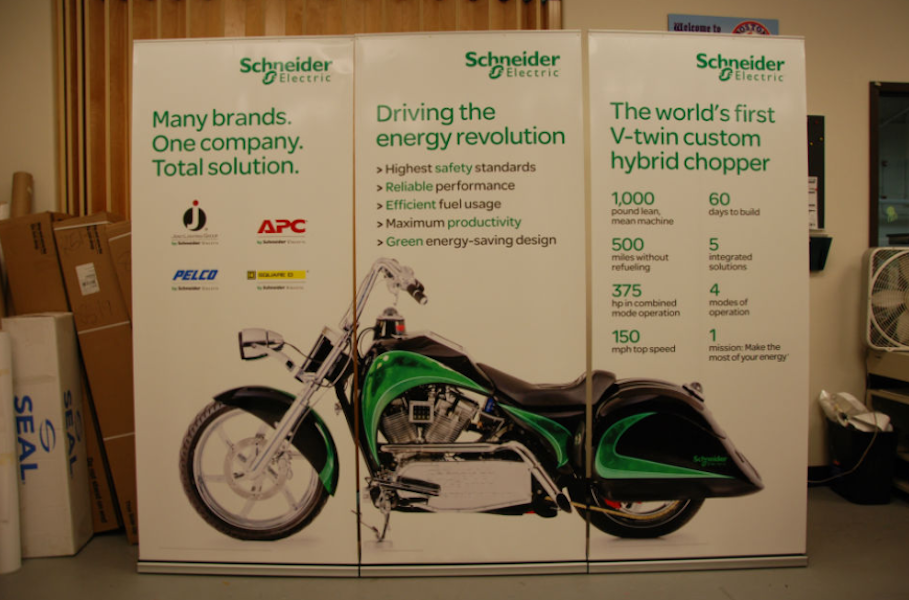
Different formats can enhance the versatility and reach of your event graphics. From posters and banners to social media graphics and digital displays, consider how each format can contribute to your event’s success.
Tailor your design to suit each format, ensuring consistency while adapting to specific requirements. For instance, mobile-friendly graphics for social media can increase engagement and encourage sharing.
Designing graphics for your next big event requires a blend of creativity, strategy, and understanding of your audience. By considering factors like brand identity, color psychology, and visual hierarchy, you can craft intentional graphics that captivate and engage. Give the team at Graphic Innovations a call at 401 751 5333 to start planning the graphics for your next big event today!


0 Comments